By Jessica Umoren
What is Gerrymandering?
Gerrymandering is Congress redrawing district lines in order to favor certain political parties, normally for a congressperson or political party to win or maintain a particular district, or to gain more electoral votes for a presidential election.
Gerrymandering is very present in today’s political climate, and both political parties have participated in it. Using data and statistics to investigate gerrymandering is straightforward.
Data
The most important part of statistics is good quality data. Gaining access to political data can be complicated because not all real data is accessible to the public and public data is not that
The data (2024 presidential election results by county) used was imported from Github.
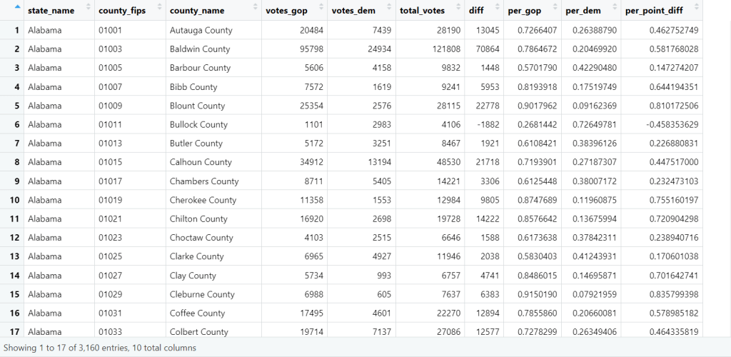
Once the data is imported into Rstudio, look at it and understand it. The categorical columns:
- State_name = state
- County_flips = zip code
- County_name = county
- Votes_gop = total gop votes
- Votes_dem = total democrat votes
- Total_votes = total votes
- Diff = difference between gop and democrat votes
- Per_gop = total gop votes / total votes
- Per_dem = total democrat votes / total votes
- Per_point_diff = percentage of difference between gop and democrat votes
Cleaning & Aggregation
Cleaning data can be really simple or time consuming. Luckily this data is pretty clean already, so we can focus on aggregating. This means renaming the data file, double checking for any errors, unnecessary columns or creating new categories, like in this case “winners”.
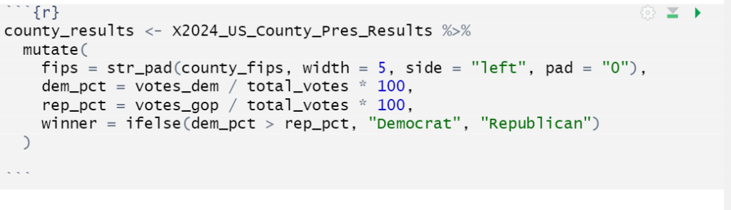
Now, ensure the U.S. county boundary data from the Census Bureau is downloaded from the tigris package in R and combine it with the elections data. This geographic data was then joined to the election results using county FIPS codes, which allowed each county’s election data to be matched with its actual shape on the map.
Once the election data and geographic data were combined, the dataset was ready to be visualized.
Choropleth Maps
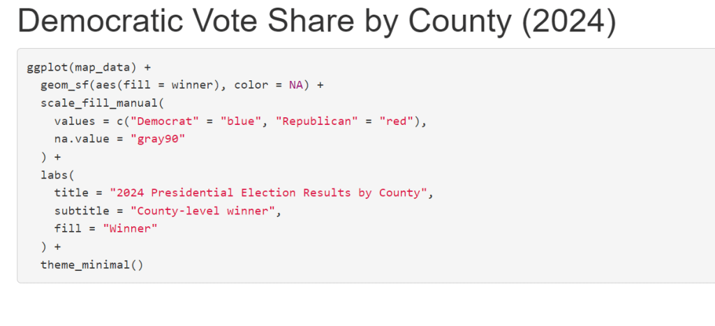
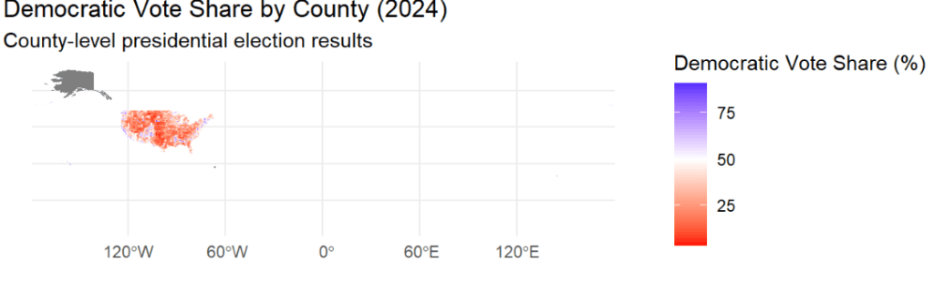
To visualize the results, I created a choropleth map showing Democratic vote share by county. In this type of map, each county is shaded based on a numeric value — in this case, the percentage of votes cast for the Democratic candidate.
Instead of a simple red-versus-blue winner map, this approach shows how strong partisan support is across counties. Darker blues indicate higher Democratic vote share, while redder areas indicate lower Democratic support.
This type of visualization is especially useful for understanding political geography.
Results & Interpretations
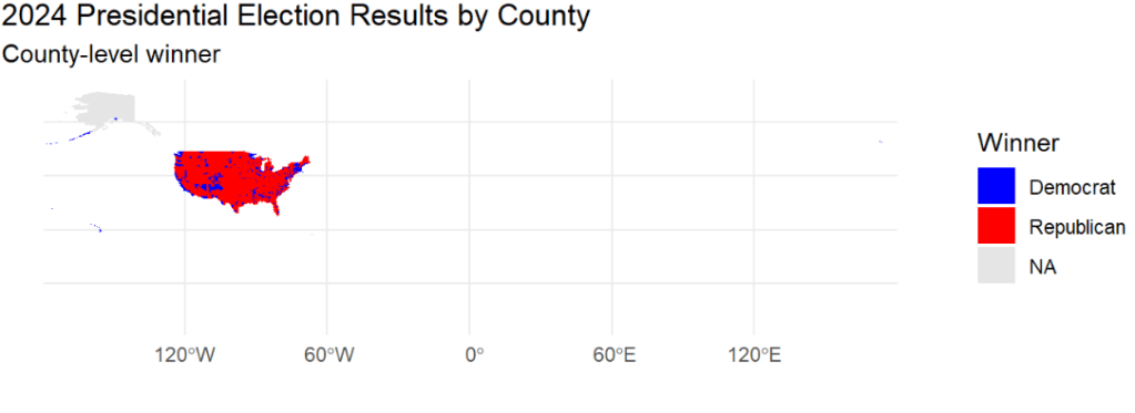
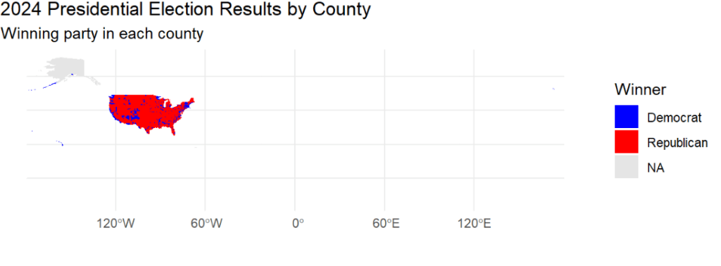
The choropleth map shows clear geographic patterns in the 2024 presidential election. Democratic voters tend to be heavily concentrated in urban counties, which appear as darker blue areas on the map. Republican support, on the other hand, is more spread out across rural counties, covering larger geographic areas with lower population density.
Although presidential elections themselves are not affected by gerrymandering, these spatial patterns help explain how gerrymandering works in legislative districting. When voters from one party are clustered tightly together, they can be packed into a small number of districts, while the opposing party’s voters are distributed more efficiently across many districts.
As a result, even when statewide vote totals are fairly close, district maps drawn along these geographic lines can still produce disproportionate representation. This visualization highlights how the geography of voters, not just vote totals, plays a major role in political outcomes.
Final Thoughts
Gerrymandering doesn’t always show up directly in election results, but data visualization makes the underlying mechanics visible. By using R to combine election data with geographic boundaries, we can see how uneven voter distributions create opportunities for grouping and dividing districts.
This kind of analysis shows why statistics and visualization are powerful tools for understanding political systems and why fair representation depends on more than just counting votes.
Jessica Umoren

Leave a Reply